active buy/sell effectivenessIntrabar up/down movement divided by intrabar up/down volume , by counting the candles in a lower time frame. This shows how much active buy/sell orders can push the price and evaluate the selling/buying pressure, and can be used to identify potential swing highs and lows or to confirm patterns.
Search in scripts for "Up down"

Supertrend ATR TableThis is a multi timeframe table that shows a supertrend based ATR for timeframes from 5 minutes to monthly.
It is one half of a set of two indicators. This one is the table and the other one, Supertrend Lines Labels Full Set plots lines and labels.
The table is arranged left to right from shortest to highest timeframe
There are also alerts for each timeframe ATR that are best placed on a chart of 15 min or higher to avoid multiple repeat alerts within a short span of time.
One of the higher level uses is to track trend progression by seeing price move from timeframe ATR to another
User inputs cover colors, and how far in ticks "near" is defined as there are four colors in the table - up, down, up/near and down/near
The ATR settings are also changeable by user input

Unreal Algo [UPRIGHT] (cc)Hello Traders,
It's finally that time, I'm releasing my baby out into the world.
Unreal Algo is the answer to the question you didn't know you were asking.
It's for beginners and advanced traders alike. I've made the settings very customizable, but also easy to just jump right in.
How it works:
It uses tons of calculations, confirmations, and filters to bring you the most accurate predictive algorithm possible. The algo will automatically adjust to different volatility in the market to still provide accurate signals and confirmation. It will automatically show support and resistance in real-time. A Moving Average cloud with speeds varying from extra fast to slow; they will help traders confirm whether they should stay in the trade. Also, I added 2 stoplosses, because the importance of risk management should always be emphasized even with strong accuracy.
Features:
---The Most Accurate Signals on the planet.
--------Buy/Sell, Up/Down direction change, and Red/Green arrows.
--- MA cloud with beautiful color blend that can act as a confirmation of direction.
-------- 17 different types/versions of moving Averages to choose from.
--------Easy line transparency and toggle adjustments.
--------Easy cloud transparency adjustments.
--- Support and Resistance .
--- Advanced PSAR that will show red when bearish while in a bullish trend, and visa-versa.
---Potential Orderblocks that can be extended to show a grid (adding additional support/resistance information).
--- Fibonacci Lines.
--- Pivot bar that changes colors based on pivot direction.
---Resistance Breakout and Support Breakdown Signals .
--- Relative volume & momentum bar coloring.
---Two Separate Stoplosses .
--------Circles change color and flip to top and red for Short, bottom and green for long.
--------Horizontal stoploss that tracks the price and flags to take profit. White for Long and Yellow for short.
---As always... Fully customizable .
Different customization options:
Without stoplosses and Support/Resistance.
Without Support/Resistance, arrows and psar removed.
Added back Support/Resistance, lightened MA cloud
Fully loaded (minus trailing stoploss)

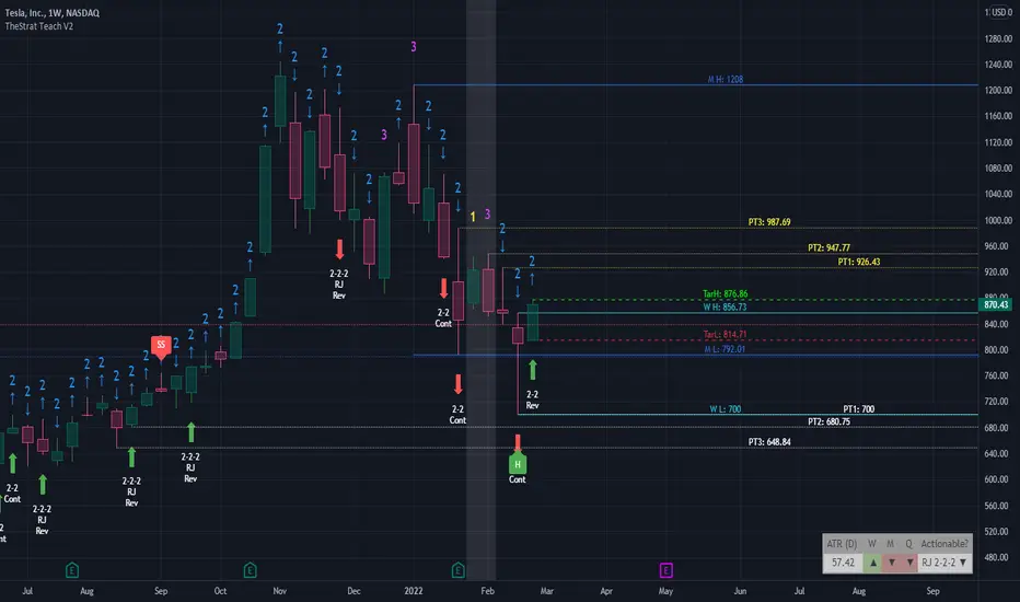
TheStrat Teach V2This indicator was coded to help me see, learn and trade TheStrat. Please share with the wider community and good luck trading. See my profile signature for contact details or questions.
// BAR NUMBERS
Using the 1, 2, 3 numbering system on the chart allows you to quickly see various combinations.
- Possibility to up/down ARROWS or the “U/D” text
- Decide which number to show and the colour
- Position and colouring are editable of numbers and bars (1, 2, 3)
- Limited to the last 100 candles for performance.
// TARGET LINES
Add target HIGH and LOW lines with custom timeframe option (default D and previous candle) to identify the target lines for long and short move.
- Possible to reposition target candle focus to previous or current candle
- Added the 50% line for visual reference or use in 0.5 retracement
- Also, possible to show both bull/bears 0.618 lines
- Ability to change all line colours and style
//HIGHER TIME FRAME
Four custom time frames can be selected to show their timeframe HIGH/LOW on lower timeframes which allows you to keep track of important price ranges on higher timeframes.
- Default to M, W, D, 1 hour including pricing labels on each HIGH/LOW line
- Able to change all line colours and styles
// TheSTRAT patterns
Once enabled it shows the various patterns historically for learning purposes to help identify the various #TheSTRAT combo or for to back test patterns.
- Patterns: 2-1-2/1-2-2/3-2-2/3-1-2/2-2-2 Randy Jackson/3-2/2-2/1-3/3-1/Pivot MG
- Added Hammers and Shooters labels
//ALERTS
Added alert conditions to setup alerts on target H/L lines and all four custom H/L lines.
- Triggers when price movement crosses above the HIGH line
- Triggers when price movement crosses below the LOW line
// INFO PANEL
The info panel is a summary information area to show Full Time Frame Continuity (FTFC) and suggests possible actionable setup on the current chart. It is possible to disable sections.
ATR(D) : shows the daily movement potential of the stock over the last 14 days
Num # : Take the percentage drawdown of portfolio size amount divided by the current stock price (15% of 5000 = 750 drawdown max)
Risk $lg : Stop loss risk amount long - shows price difference between the current candle low and previous candle low, assuming you use this for your stop loss x Num #
Risk $lg : Stop loss risk amount short - shows price difference between the current candle low and previous candle low, assuming you use this for your stop loss x Num #
H/4H/D/W/M : Full Time Continuity (FTC) to see if open is above (green) or below (red) close of current candle in that time frame
Actionable? : Suggest if current view have a possible #TheStrat actionable combo
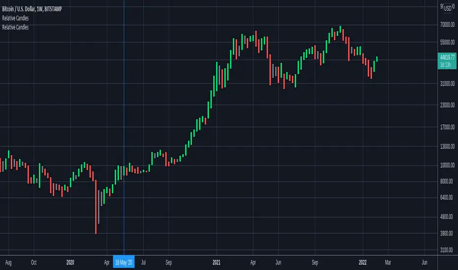
Relative CandlesCustom candles which only didsplay highs and lows. Color depends on relative position of highs and lows and indicates whether it is going up, down or indecision based on this relative position. Made specially for superchiqui :P
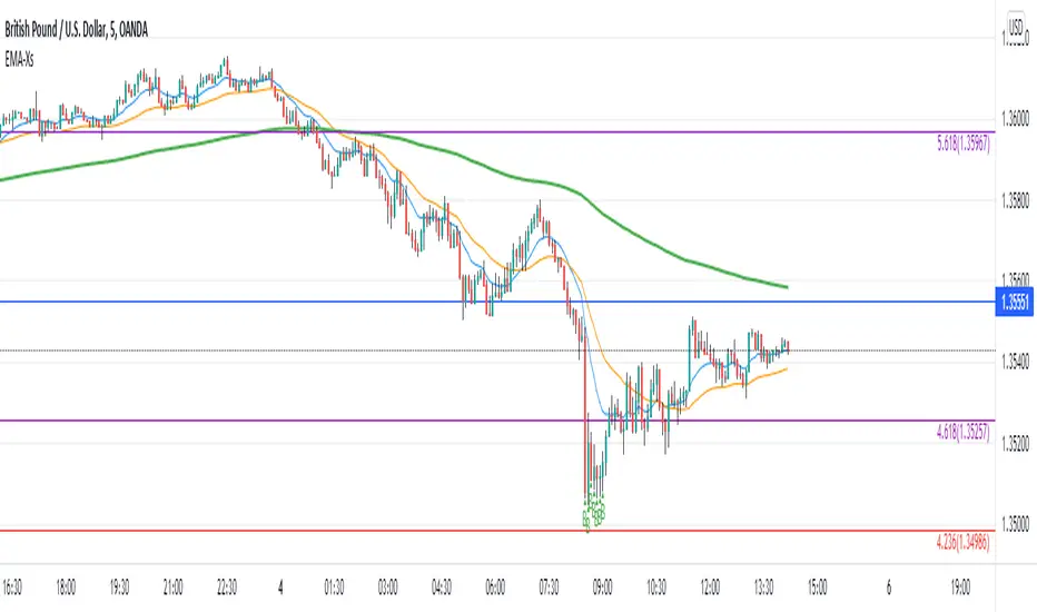
Reversal off EMA-XsEMA-Xs works mostly on Forex due to the small prices and price fluctuations. It does work on Gold, oddly enough, and some others like UKX 100...but mostly on forex. It doesn't work as well on JPY pairs but occasionally does; the JPY pairs give less signals, but when a JPY pair gives a signal, its a high probability setup. Another script EMA-XL works better on the higher priced instruments like S&P, DJI, OIL, BTC etc.
This script will show 3 moving averages: 13, 34, 200 and works on the 5m, 1hr, 4hr, daily charts. Signals "B" or "S" will be on the chart above or below the candles respectively.
When to open:
The script gives buy and sell signals based on a counter-trend move away from the MA's. When the price rises a specific percent above/below the EMA, it'll give a signal. It's best to take a trade when it gives a cluster of consecutive signals near the same price. If using on the 5m, definitely wait for consecutive signals. Also, use this in conjunction with support and resistance areas. Using with fibs for confirmation really makes this a good tool with high probability: IE, when price hits a fib and the script gives a signal, its a high probability setup.
When to close:
1. After a fast move up/down you may use this to counter trade a scalp 10+ pips, but you need to be quick; applies mostly to the 5m chart.
2. If you have the tenacity wait until you see an opposite signal. With this method you may be holding a loosing trade for a while. But what I've noticed is if it trends against you, price usually with come near to the first time it signaled. You may want to stack trades on each cluster of signals. IE first trade is 1000 units, next is 2000 units, etc... then close when prices comes near the first time it signaled. By this time, if you held, you should have profit. This strategy will really test your mental resilience.
3. Wait until it comes back to one of the trendlines; remember this is a counter trend signal so price is moving away from the MA and it always returns to touch one of the MA's...LOL eventually
4. Applying to scalping on the 5m, keep the stops tight because if the instrument trends hard and fast, you'll be upside-down quickly.
If you put a lot of time into using this signal generator, you can really make good profit. But with all tools, you need to master it. There are nuances to the simple logic of this script that can be both fun and frustrating. With all endeavors, if you put the time into it, you will reap the rewards.
Good luck and let me know if you have any questions/comments.
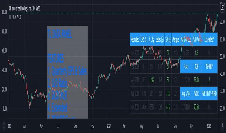
TL Data PanelIntroducing the TraderLion Data Panel
Features
1. Plot Quarterly EPS & Sales in a table. Disclaimer | TradingView data for EPS & Sales can be highly inaccurate in some cases.
2. U/D Ratio - Calculates the Up/Down Volume Ratio on a 50 Day Average or 20 Day Average. A number above 1.5 will show in green.
3. DCR - Calculates the Daily Closing Range for the stock. It's green when the DCR is greater than your benchmark (set in indicator settings) and greater than 50%.
4. WCR - Calculates the Weekly Closing Range for the stock. It's green when the DCR is greater than your benchmark (set in indicator settings) and greater than 50%.
5. Extended - Calculates if the stock is extended vs the 10DMA and 10WMA. The output will be Yes or No.
6. RSNHBP Count - Counts the number of RSNHBP in the past 30 sessions. Higher the count the better the odds of a stock performing well in the markets.
7. HV Stats - This shows if a stock meets the HVE/HV1/HVIPO criteria. HVE - Highest Volume Ever. HV1 - Highest Volume in One Year. HVIPO - Highest Volume Since IPO.
Customizations
Up Down Volume Length - Toggle between 50 Day or 20 Day.
Average $ Volume Length - Toggle between 50 Day or 20 Day.
Closing Range Benchmark - Set your benchmark vs any index.
RS Benchmark - Calculate RSNHBP benchmark vs any index.
Table Size - Tweak table size on personal preference.
Table Position - Tweak table position to top right, bottom left, bottom right, or top left.
Margins vs ROE - Toggle this setting to display Margins or ROE.
Color Theme - Toggle between Light or Dark Theme.
If you have any questions, please post them in the comments below!
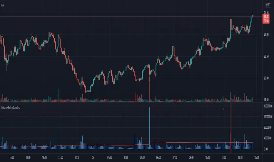
Volume Entry CandlesIntroduction
For Wyckoff, three things are important in analyzing the market: price, time, and volume . This indicator provides two types of signals:
- linked to large movements of volumes (red and purple circles on top);
- large price movements concerning volatility (green/red triangle up/down);
In the first case, it highlights the volumes that differ from the most common values, allowing us to trace the levels that the market feels.
Two levels highlight the volume peaks and two calculation methods can be chosen: by exponential moving average or by standard deviation.
In the second case, the signal is based on Volatility and highlights the cases in which the high and low of the last three candles exceed the ATR by a certain number of times. This may indicate situations where the market corrects the price after a fairly large move.
in addition, a table will give us statistical information that tells us:
- from how many candles a condition does not occur
- the average of the candles for which it occurs
- the maximum number of candles for which this condition has not occurred
Obviously, like any statistical tool, it is not intended as absolute certainty
Settings
Analyze all / Minutes: By checking the box, we analyze all the candles in the chart, removing the check will only analyze the period set in minutes.
Type of Level: Select the strategy to calculate the critical levels of the volumes, we can choose Ema or Standard Deviation.
Minimum tail in %: here we can exclude candles where tails aren't enough big, for example if we want to exclude candles without a tail. Use a negative value to ignore this control
We then have three groups:
- the first for the EMA ;
- the second for the Standard Deviation;
- the third for the ATR and its multiplier;
each has configuration parameters such as period and multiplier
Period: length for Ema , or Standard Deviation or ATR function
level1 and level2: they are the multipliers for the two levels
ATR multiplier: multiply the ATR value that must be exceeded by ( high-low ) of the last few candles
n candles: set the number of candles
Help
Show Vol Histogram to fine-tuning: if checked show histogram and lines to tune the indicator
Dimension: to set the histogram dimension
Base: set the price level where we want the histogram, in fact, the histogram is not dynamically displayed, it needs a price to appear
How to use
I follow this step for scalping trading:
- Select time frame 1 minute;
- Personally, I deselect "show the first level", and use only the second level;
- In the candles indicated by the purple circle and I draw a horizontal line on the closing of the candle;
- I can use the levels plotted with time frames at 1min also the time frames at 3min and 5 min
the volatility trigger appears as green/red columns in the histogram.
- green colors indicate a bullish reversal;
- red colors indicate a bearish reversal;
Example Bullish reversal
Moderate risk:
Entry point: above high
Stop loss: below low
High risk:
Entry point: a half body of the trigger candle
Stop loss: 1 ATR below the low of the trigger candle
Tips
Pair this indicator with some Moving Average and/or divergence indicator.
This is the twin of an indicator that I made, called "Volume Analysis". It's better if you prefer to analyze levels by yourself and keep the volume values always visible
Volume Analysis Chart v2.0Introduction
For Wyckoff, three things are important in analyzing the market: price, time, and volume . This indicator provides two types of signals:
- linked to large movements of volumes (red and purple circles on top);
- large price movements concerning volatility (green/red triangle up/down);
In the first case, it highlights the volumes that differ from the most common values, allowing us to trace the levels that the market feels.
Two levels highlight the volume peaks and two calculation methods can be chosen: by exponential moving average or by standard deviation.
In the second case, the signal is based on Volatility and highlights the cases in which the high and low of the last three candles exceed the ATR by a certain number of times. This may indicate situations where the market corrects the price after a fairly large move.
in addition, a table will give us statistical information that tells us:
- from how many candles a condition does not occur
- the average of the candles for which it occurs
- the maximum number of candles for which this condition has not occurred
Obviously, like any statistical tool, it is not intended as absolute certainty
Settings
Analyze all / Minutes: By checking the box, we analyze all the candles in the chart, removing the check will only analyze the period set in minutes.
Type of Level: Select the strategy to calculate the critical levels of the volumes, we can choose Ema or Standard Deviation.
Minimum tail in %: here we can exclude candles where tails aren't enough big, for example if we want to exclude candles without a tail. Use a negative value to ignore this control
We then have three groups:
- the first for the EMA ;
- the second for the Standard Deviation;
- the third for the ATR and its multiplier;
each has configuration parameters such as period and multiplier
Period: length for Ema , or Standard Deviation or ATR function
level1 and level2: they are the multipliers for the two levels
ATR multiplier: multiply the ATR value that must be exceeded by ( high-low ) of the last few candles
n candles: set the number of candles
Help
Show Vol Histogram to fine-tuning: if checked show histogram and lines to tune the indicator
Dimension: to set the histogram dimension
Base: set the price level where we want the histogram, in fact, the histogram is not dynamically displayed, it needs a price to appear
How to use
I follow this step for scalping trading:
- Select time frame 1 minute;
- Personally, I deselect "show the first level", and use only the second level;
- In the candles indicated by the purple circle and I draw a horizontal line on the closing of the candle;
- I can use the levels plotted with time frames at 1min also the time frames at 3min and 5 min
the volatility trigger appears as green/red columns in the histogram.
- green colors indicate a bullish reversal;
- red colors indicate a bearish reversal;
Example Bullish reversal
Moderate risk:
Entry point: above high
Stop loss: below low
High risk:
Entry point: a half body of the trigger candle
Stop loss: 1 ATR below the low of the trigger candle
Tips
Pair this indicator with some Moving Average and/or divergence indicator.
This is the twin of an indicator that I made, called "Volume Analysis". It's better if you prefer to analyze levels by yourself and keep the volume values always visible

Consensio V2 - Directionality IndicatorThis indicator is based on Consensio Trading System by Tyler Jenks.
It is used for measuring the Directionality of the market.
According to this trading system, you start by laying 3 Simple Moving Averages:
A Long-Term Moving Average (LTMA).
A Short-Term Moving Average (STMA).
A Price Moving Average (Price).
*The "Price" should be A relatively short Moving Average in order to reflect the current price.
What is Direction(D)?
Each Moving Average at any given time is pointing in a certain direction. It can either go Up, Down, or it can be in a Consolidation state.
That's why, each Direction(D) is assigned to a score :
Up = 2
Consolidation = 1
Down = 0
For example, if LTMA is directed Up, then D =2.
What is Influence(I)?
Generally, The fluctuation of the "Price" tends to have less influence on the "LTMA" than the fluctuation of the "STMA".
this is why each Moving Average has different degree of Influence(I):
LTMA = 9
STMA = 3
Price = 1
Moving Average Score
To calculate the score of a Moving Average, you Multiply the Moving Average Direction(D) by its Influence(I).
For example, if LTMA is directed Up then the score of this Moving Average is 18.
What is Directionality?
Directionality is the sum of all 3 Moving Averages score minus 13.
For example, if the score of LTMA=18 and STMA=6 and Price=2, then Directionality is equal to 13.
Also, if the score of LTMA=0 and STMA= 0 and Price=0, then Directionality is equal to -13.
When Directionality is bigger than 0 the Directionality is Bullish.
When Directionality is smaller than 0 the Directionality is Bearish.
Conclusion
Consensio Directionality Indicator helps us measure the Directionality of the market. Knowing the Directionality of the market helps us build better trading strategies.
Recommendations
Different Moving Averages may suit you better when trading different assets on different time periods. You can go into the indicator settings and change the Moving Averages values if needed.
you should also use the "Consensio Relativity Indicator" In order to Understand the Market state.
While using both of my Consensio indicators together, please make sure that the Moving Averages on both of them are set to the same values

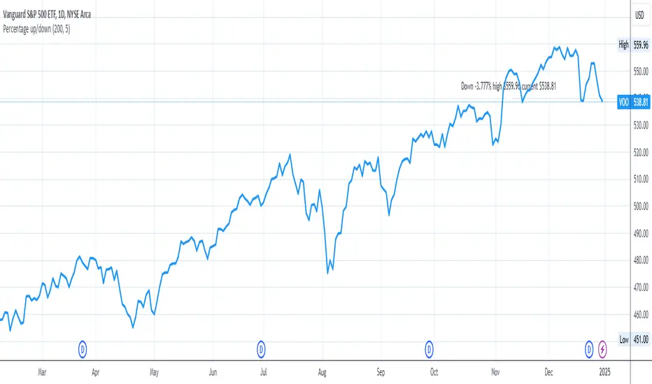
Percentage up/downIn order to buy stocks, I want to know how much the stock went down from the all-time high price. Therefore, this script shows how much the current stock has dropped from the all-time high.
You can change:
- how many periods to get the all-time high from
- location on the y-axis to place the label on the chart
RGB Color FiddlerKEEP YOUR COINS FOLKS! I DON'T NEED THEM, DON'T WANT THEM. Many other talented authors on TV deserve them.
INTRODUCTION:
This is my "RGB Color Fiddler", intended as a toy to play with. This colorcator is rated 'E' for every TV member. With this you can quickly generate about 1.67 million potential colors from color.rgb(). While I have a few preferred colors that are ideal for use, this allows you to finely tune colors to anything that pleases your eye on your canvas.
TIPS:
The overlay chart can be peppered with colors of all varieties, so it's necessary to have properly distinguished coloring and contrast separation. If you employ light charts, you can tweak colors to just the right shade you desire on your display. Not all LCDs are created equal, even when color calibrated. With specific discovered colors tailored to your liking, you may uniquely color code ALL of your indicators.
UTILITY:
The input()s in Settings allow up to 4 different colors to tinker with and compare. After selecting focus of an input, you can easily use the up/down keyboard keys to make swift adjustments numerically or with options. The color combos you are creating will be displayed in color hex or a RGB representation within the labels.
Also of great benefit, is the ability to cycle through the currently available plot() styles. Some styles will require you to zoom in closeup to observe their behaviors. There is a few other ways to finagle plot() parameters to also achieve other acrobatic effects that are not demonstrated here. Closer study of plot() parameters in the reference can reveal those. Anyhow, I won't bother you with more elaborate technical jargon, now is the time to fiddle with this toy to your benefit!
CODE REUSE:
Any member has the freedom to use any of the code in this script any way they see fit. It's specifically intended for all. There is absolutely no need for accreditation for any of this code reuse ever, in the present case. Don't worry about, I'm certainly not.
When available time provides itself, I will consider your inquiries, thoughts, and concepts presented below in the comments section, should you have any questions or comments regarding this indicator. When my indicators achieve more prevalent use by TV members , I may implement more ideas when they present themselves as worthy additions. Have a profitable future everyone!

Dow Theory Trend Direction VisualizerJapanese below / 日本語説明は下記
Overview
What is difficult for beginner traders is to identify trend occurrence, continuation and reversal.
This indicator visualizes market direction by changing background colors based on Dow Theory so that traders can visually grasp trends.
Sample chart
Functions
1.MTF Higher High/Lower High/Higher Low/Lower Low(HH/LH/HL/LL)
Indicator shows HH/LH/HL/LL of an upper timeframe(MTF) and those of chart’s timeframe at the same time.
As usual, HH/LH/HL/LL of chart’s timeframe can be used to identify trend continuation based on Dow Theory while MTF HH/LH/HL/LL can be used as support/resistance.
Auto and manual mode for MTF
When you select “Auto” mode, then an upper timeframe will be automatically determined as MTF based on chart’s timeframe. If “Manual “ mode selected, then you need to specify MTF timeframe.
MTF HH/LH/HL/LL are displayed only below the selected MTF timeframe so it will not disturb when you open higher timeframe.
For instance, if you select daily timeframe as MTF, then HH/LH/HL/LL of daily timeframe will be shown on 4 hour or below timeframes.
Sample chart (AUDJPY 4H + Daily timeframe HH/LH/HL/LL )
In this chart, you can see two different timeframe’s trend.
In 4hour timeframe, a new high recorded as HH and in daily timeframe, lows going up from LL to HL and high going up from LH to HH hence daily chart is uptrend.
Also, you can predict that Daily HH would be respected as resistance line.
2.Visualize trends direction with colors based on HH/LH/HL/LL.
Background color will change based on break up/down of HH/LH/HL/LL.
———————
トレードを習得する上で多くの人が苦手意識を持つ「目線付け」。
この目線付けをダウ理論を元に訓練するためのインジケーターを開発しました。
高値·安値の更新状況に応じて相場の方向性を色で可視化するため、視覚的に目線付けをすることが可能です。
サンプルチャート
ダウ理論による目線付けの二つの方法
これは僕の持論ですが、ダウ理論による目線付けの方法には、「トレンドは明確なシグナルが出るまで継続する」という原則を共通の拠り所とする二つの方法があると考えています。
一つは日本人投資家/トレーダーにも良く知られている押し安値·戻り高値を基準とする方法。そしてもう一つは高値·安値の切り上げ·切り下げのみを基準とする方法です。
このインジケーターは後者の方法で目線を可視化します。
(もちろん押し安値·戻り高値と併用した目線判断にも活用可能です。)
機能
1.上位足とチャートの時間軸両方のHigher High/Lower High/Higher Low/Lower Low(HH/LH/HL/LL)の表示(MTF機能)
上位足タイムフレームのHH/LH/HL/LLとチャートタイムフレームのHH/LH/HL/LLを同時に表示することができます。
チャートタイムフレームのHH/LH/HL/LLはダウ理論に基づくトレンドの継続・反転の判断用に、上位足のHH/LH/HL/LLは上位足での高値・安値の切り上げ/切り下げ判断及びレジスタンス・サポートとして使うことができます。
上位足の選択には自動モードとマニュアルモードが選択可能です。自動モードを選択した場合、チャートのタイムフレームに応じて上位足が自動的に決定されます。マニュアルモードの場合は選択した時間軸が上位足タイムフレームとして適用されます。
上位足のHH/LH/HL/LLは選択したタイムフレーム未満でのみ表示されます。例えば上位足のタイムフレームとして日足を選択した場合、日足のHH/LH/HL/LLは日足未満でのみ表示されます。
サンプルチャート (AUDJPY 4H に日足のHH/LH/HL/LL を表示)
このチャートでは二つの異なるタイムフレームの高値・安値更新状況を一度に把握することができます。
4Hでは高値の切り上げが発生しているため、安値を更新しなければ上昇トレンド確定です。一方日足では安値がLLからHLへ(赤の矢印)、高値がLHからHHへと切り上がり(緑の矢印)、上昇トレンドであることがわかります。
また、この場面では上位足のHHがレジスタンスとして機能する可能性も予測できます。
2.目線の方向を色で可視化
HH/LH/HL/LLの更新状況から目線を判断し、背景色とともに可視化します。
Higher High/Lower High/Higher Low/Lower Lowとは何か?
日本人投資家/トレーダーの中にはあまり馴染みのない方もいるかと思いますので、定義を記載します。
Higher High(HH)
切り上がった高値を意味します。当インジケーターでは一つ前の高値(HH/LH)から切り上がった場合にHHとしています。
Lower High(LH)
切り下がった高値を意味します。Lower Highなのでより低い方の高値という意味です。当インジケーターでは一つ前の高値(HH/LH)から切り下がった場合にLHとしています。
Higher Low(HL)
切り上がった安値を意味します。Higher Lowなのでより高い方の安値という意味です。当インジケーターでは一つ前の安値(HL/LL)から切り上がった場合にHLとしています。
Lower Low(LL)
切り下がった安値を意味します。当インジケーターでは一つ前の安値(HL/LL)から切り下がった場合にLLとしています。
使い方
高値·安値の切り上げ·切り下げの判断及びトレンド継続·転換の判断に活用

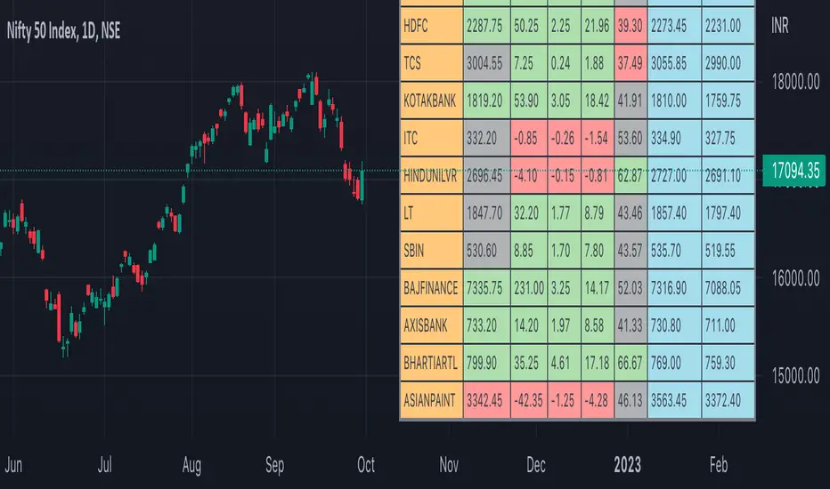
Nifty50 Participants - Top 25Nifty50 Index is calculated based on the movements of its participants. Every time you think of why is Index going up/down, who is actively dragging the index either ways, this Indicator gives you answer for the same in realtime!
This indicator will help you in pre-planning your trades based on the movements shown by different stocks of various sectors in Index calculation.
RSI column is an add-on to the participation table which will help you in getting RSI values of different stocks of Nifty 50 at a glance. You will see values getting updated in realtime in live market.
Checkout for customisations in indicator settings.
Note:
1. Participants present in this indicator and their participation percentage is taken from the official NSE website.
2. Table shows Top 25 participants by default. If you want to see less than 25 rows, you can update the input via indicator settings.
Feel free to contribute/comment changes if any! Comment in case of any suggestions :)
- Published by Soham Dixit
Synthetic Price Action GeneratorNOTICE:
First thing you need to know, it "DOES NOT" reflect the price of the ticker you will load it on. THIS IS NOT AN INDICATOR FOR TRADING! It's a developer tool solely generating random values that look exactly like the fractals we observe every single day. This script's generated candles are as fake as the never ending garbage news cycles we are often force fed and expected to believe by using carefully scripted narratives peddled as hypnotic truth to psychologically and emotionally influence you to the point of control by coercion and subjugation. I wanted to make the script's synthetic nature very clear using that analogy, it's dynamically artificial. Do not accidentally become disillusioned by this scripts values, make trading decisions from it, and lastly don't become victim to predatory media magic ministry parrots with pretty, handsome smiles, compelling you to board their ferris wheel of fear. Now, on to the good stuff...
BACKSTORY:
Occasionally I find myself in situations where I have to build analyzers in Pine to actually build novel quantitative analytic indicators and tools worthy of future use. These analyzers certainly don't exist on this platform, but usually are required to engineer and tweak algorithms of the highest quality with the finest computational caliber. I have numerous other synthesizers to publish besides this one.
For many reasons, I needed a synthetic environment to utilize the analyzers I built in Pine, to even pursue building some exotic indicators and algorithms. Pine doesn't allow sourcing of tuples. Not to mention, I required numerous Pine advancements to make long held dreams into tangible realities. Many Pine upgrades have arrived and MANY, MANY more are in need of implementation for all. Now that I have this, intending to use it in the future often when in need, you can now use it too. I do anticipate some skilled Pine poets will employ this intended handy utility to design and/or improved indicators for trading.
ORIGIN:
This was inspired by the brilliance from the world renowned ALGOmist John F. Ehlers, but it's taken on a completely alien form from its original DNA. Browsing on the internet for something else, I came across an article with a small code snippet, and I remembered an old wish of mine. I have long known that by flipping back and forth on specific tickers and timeframes in my Watchlist is not the most efficient way to evaluate indicators in multiple theatres of price action. I realized, I always wanted to possess and use this sort of tool, so... I put it into Pine form, but now have decided to inject it with Pine Script steroids. The outcome is highly mutable candle formations in a reusable mutagenic package, observable above and masquerading as genuine looking price candles.
OVERVIEW:
I guess you could call it a price action synthesizer, but I entitled it "Synthetic Price Action Generator" for those who may be searching for such a thing. You may find this more useful on the All or 5Y charts initially to witness indication from beginning (barstate.isfirst === barindex==0) to end (last_bar_index), but you may also use keyboard shortcuts + + to view the earliest plottable bars on any timeframe. I often use that keyboard shortcut to qualify an indicator through the entirety of it's runtime.
A lot can go wrong unexpectedly with indicator initialization, and you will never know it if you don't inspect it. Many recursively endowed Infinite Impulse Response (IIR) Filters can initialize with unintended results that minutely ring in slightly erroneous fashion for the entire runtime, beginning to end, causing deviations from "what should of been..." values with false signals. Looking closely at spg(), you will recognize that 3 EMAs are employed to manage and maintain randomness of CLOSE, HIGH, and LOW. In fact, any indicator's barindex==0 initialization can be inspected with the keyboard shortcuts above. If you see anything obviously strange in an authors indicator, please contact the developer if possible and respectfully notify them.
PURPOSE:
The primary intended application of this script, is to offer developers from advanced to even novice skill levels assistance with building next generation indicators. Mostly, it's purpose is for testing and troubleshooting indicators AND evaluating how they perform in a "manageable" randomized environment. Some times indicators flake out on rare but problematic price fluctuations, and this may help you with finding your issues/errata sooner than later. While the candles upon initial loading look pristine, by tweaking it to the minval/maxval parameters limits OR beyond with a few code modifications, you can generate unusual volatility, for instance... huge wicks. Limits of minval= and maxval= of are by default set to a comfort zone of operation. Massive wicks or candle bodies will undoubtedly affect your indication and often render them useless on tickers that exhibit that behavior, like WGMCF intraday currently.
Copy/paste boundaries are provided for relevant insertion into another script. Paste placement should happen at the very top of a script. Note that by overwriting the close, open, high, etc... values, your compiler will give you generous warnings of "variable shadowing" in abundance, but this is an expected part of applying it to your novel script, no worries. plotcandle() can be copied over too and enabled/disabled in Settings->Style. Always remember to fully remove this scripts' code and those assignments properly before actual trading use of your script occurs, AND specifically when publishing. The entirety of this provided code should never, never exist in a published indicator.
OTHER INTENTIONS:
Even though these are 100% synthetic generated price points, you will notice ALL of the fractal pseudo-patterns that commonly exist in the markets, are naturally occurring with this generator too. You can also swiftly immerse yourself in pattern recognition exercises with increased efficiency in real time by clicking any SPAG Setting in focus and then using the up/down arrow keys. I hope I explained potential uses adequately...
On a personal note, the existence of fractal symmetry often makes me wonder, do we truly live in a totality chaotic universe or is it ordered mathematically for some outcomes to a certain extent. I think both. My observations, it's a pre-deterministic reality completely influenced by infinitesimal amounts of sentient free will with unimaginable existing and emerging quantities. Some how an unknown mysterious mechanism governing the totality of universal physics and mathematics counts this 100.0% flawlessly and perpetually. Anyways, you can't change the past that long existed before your birth or even yesterday, but you can choose to dream, create, and forge the future into your desires and hopes. As always, shite always happens when your not looking for it. What you choose to do after stepping in it unintentionally... is totally up to you. :) Maybe this tool and tips provided will aid you in not stepping in an algo cachucha up to your ankles somehow.
SCRIPTING LESSONS PORTRAYED IN THIS SCRIPT:
Pine etiquette and code cleanliness
Overwrite capabilities of built-in Pine variables for testing indicators
Various techniques to organize Settings panel while providing ease of adjustment utility
Use of tooltip= to provide users adequate valuable information. Most people want to trade with indicators, not blindly make adjustments to them without any knowledge of their intended operation/effects
When available time provides itself, I will consider your inquiries, thoughts, and concepts presented below in the comments section, should you have any questions or comments regarding this indicator. When my indicators achieve more prevalent use by TV members , I may implement more ideas when they present themselves as worthy additions. Have a profitable future everyone!
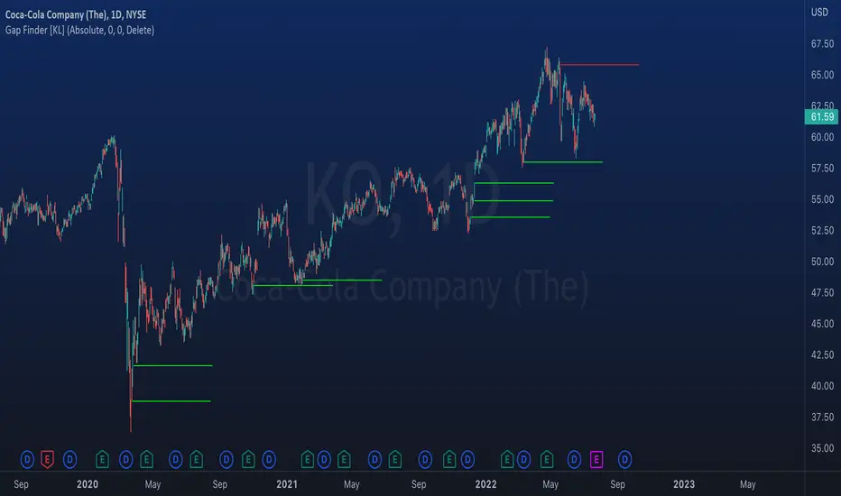
Indicator: Gap Finder [KL]
About gaps:
A gap is a “jump” in a security’s price between the Open and the Prior Close . Gaps are very common in stocks during opening hours, especially when accompanied by catalysts.
What this indicator does:
This script will identify gaps that remained unfilled for at least one candle.
It is very common for gaps to be filled on the first candle, these gaps are arguably less meaningful, so they are ignored by the indicator to reduce the number of lines drawn.
Applications:
Since most gaps eventually get filled, the question is a matter of when . If going with the trend, a trader will open a long/short position when seeing an up/down gap. When going against the trend, then short/long the stock on up/down gaps and consider taking profits when price returns to where the gap originally occurred.
Originally intended for 1D timeframes, but gaps can occur in all timeframes. Applications are limitless.
[GB]Commodity Futures MapPuts numerous commodity futures on the same scale. The main function is RSI (without evoking "oversold/bought" concepts).
Reading the chart: Much like any oscillator, the important elements are:
Position relative to the middle
Slope
Momentum
Volatility
Settings:
RSI length
EMA smoothing
Time Frame (of the indicator, not the chart(
May add value when asking questions like:
Is lumber trending?
Is silver trending faster than gold?
Is the entire asset class trending up down or not at all?
Adding additional symbols is easy since the code for each symbol is identical.

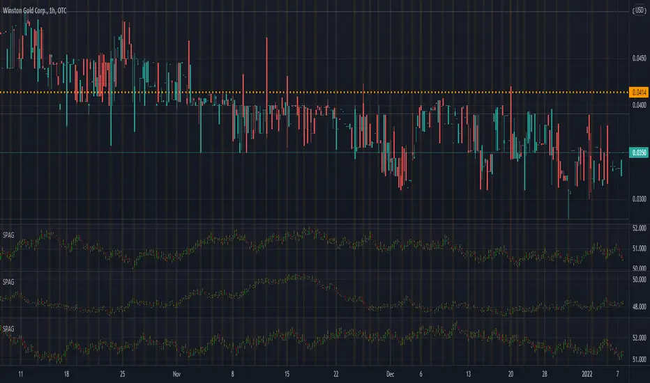
Riles' RotationThis indicator is built off of the 1 hour time frame. I used the ZigZag indicator to get 500 data points on BTC since last april, ruling out <2% deviations in price. Taking those percentages, I ran them through an excel sheet and found which deviations were the most common. An up/down relationship I will call a rotation, there are 250 rotations derived from the 500 points of data. Thus, this indicator is based off of a 250 EMA. Each band is a common deviation on the 1 hour time frame, as indicated by an excel generated histogram. The common deviations also appear relevant on the daily timeframe for BTC. This demonstrates potential support and resistance, as well as potential mean reversion. Do not take trades blindly based off of it. It merely shows potential support and resistance based off of historical percentage deviations from the 250 EMA.

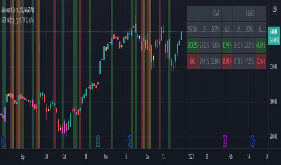
[BM] SSS 50% Rule EvaluatorSara Strat Sniper 50% Rule Evaluator
█ OVERVIEW
This indicator is based on Sara Strat Sniper's - 50% Rule for trading Outside Bars and helps you to evaluate the historical success rate of that rule.
█ FEATURES
Calculation
• You can choose to evaluate only the current bar to see if it forms an outside bar (success) or not (fail), but you can also choose to include the next bar to see if that one forms a compound outside bar.
• You can enable a start and/or end date to limit the calculation period.
Table
• Show or hide the table with the calculation results.
• Show or hide the calculation details (up/down data).
• Position of the table, opacity, cell width and text size can be customized.
Colors
• Table colors can be customized.
• You can choose to show the inside/outside bars in customizable bar colors.
• You can choose to identify successful/failed/recovered outside bars in customizable background colors.
█ LIMITATIONS
• This script uses a special characteristic of the `security()` function allowing the inspection of intrabars — which is not officially supported by TradingView.
• Intrabar inspection only works on some chart timeframes: 5, 10, 15, 30, 45 and 195 minutes, 1, 2, 3, 4, 5, 6, 7 and 8 hours, 1, 2, 3, 4 and 5 days, 1, 2, 3 and 4 weeks, 1, 2, 3, 4, 5, 6, 7, 8, 9, 10, 11 and 12 months. The script’s code can be modified to run on other resolutions.
• There is a limit to how far back intrabar calculations can be performed, and is dependant on both the intrabar resolution and your subscription (which determines the number of available bars).
VolatilityDivergenceRedGreen by STTAName: VolatilityDivergenceRedGreen by STTA
- Underlying and implied volatiliy normally show negative correlated behavior (price rises, vola falls and vice versa)
- This study shows symbols in on candles in chart where Undelying and corresponding vola index show same bahvior for 1,2 or 3 consecutive bars. (price rises and vola rises and vice versa)
- This situation is called Vola Divergence. Red, when prices and vola fall; green, when price and vola rise
- This information can be used to detect possible end of Up/Down-Swings.
- User can configure if rising or falling or both price movements shall be displayed.
- This study can be used with root symbols, which provide corresponding volatility indices.
- supported Root Symbols: SPX, NDQ, DJI, RUT, CL, XLE, GC, SI, EUR, HSI, FXI, EWZ, AMZN, AAPL, GS, GOOG, IBM, DEU40
- in all other symbols, no symbols are displayed.
Inputs
- underlying displayed in chart
Settings/Parameter
- each Divergence can be switched off/on separately
- output of each displayed symbol can be configured
Outputs
- RedDiv1: first bar with rising price and rising volatility index
- GreenDiv1: first bar with falling price and falling volatility index
- RedDiv2: second bar in a row with rising price and rising volatility index
- GreenDiv2: second bar with falling price and falling volatility index
- RedDiv3: third bar in a row with rising price and rising volatility index
- GreenDiv3: third bar in a row with falling price and falling volatility index

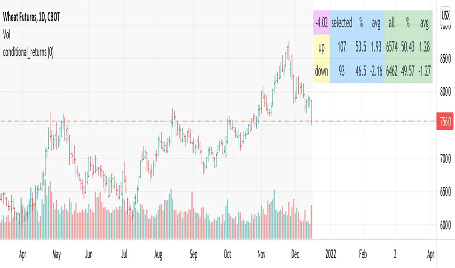
conditional_returnsThis script attempts to contextualize the instrument's latest return. It asks, "when a return of the same or greater magnitude occurred in the past, in the same direction, what was the following period's return?"
By default, the latest return is used. For example, on a daily chart, that would mean "today's" return. However, you can select any return you want using the "override" input.
The output table shows:
- The latest/override return, as a percentage. This is in the top left, fuchsia cell.
The first three, blue columns, show:
- The count of up and down (or positive and negative) next period returns. This shows you the sample size.
- The percentage of up/down next period returns.
- The average next-period return return, up and down, as percentages.
The next three, green columns show these same statistics, but for all returns--every period in the active date range is used. This data serves as a basis for comparison.
Note that you can select a custom date range with the "start" and "end" inputs. The corresponding area on the chart is shaded light grey, to show which data is used in the computations.
TASC 2022.01 Improved RSI w/Hann█ OVERVIEW
TASC's January 2022 edition Traders' Tips includes the "(Yet Another Improved) RSI Enhanced With Hann Windowing" article authored by John Ehlers. Once again John Ehlers revolutionizes the RSI indicator. This is TradingView's Pine Script code for the indicator.
█ CONCEPTS
By employing a Hann windowed finite impulse response filter ( FIR ), John Ehlers has enhanced the "Relative Strength Indicator" ( RSI ) to provide an improved oscillator with exceptional smoothness.
█ NOTES
Calculations
The method of calculations using "closes up" and "closes down" from Welles Wilder's RSI described in his 1978 book is still inherent to Ehlers enhanced formula. However, a finite impulse response (FIR) Hann windowing technique is employed following the closes up/down calculations instead of the original Wilder infinite impulse response averaging filter. The resulting oscillator waveform is confined between +/-1.0 with a 0.0 centerline regardless of chart interval, as opposed to Wilder's original formulation, which was confined between 0 and 100 with a centerline of 50. On any given trading timeframe, the value of Ehlers' enhanced RSI found above the centerline typically represents an overvalued region, while undervalued regions are typically found below the centerline.
Background
The original RSI indicator was designed by J. Welles Wilder and presented in his "New Concepts in Technical Trading Systems" book published in 1978.
Join TradingView!

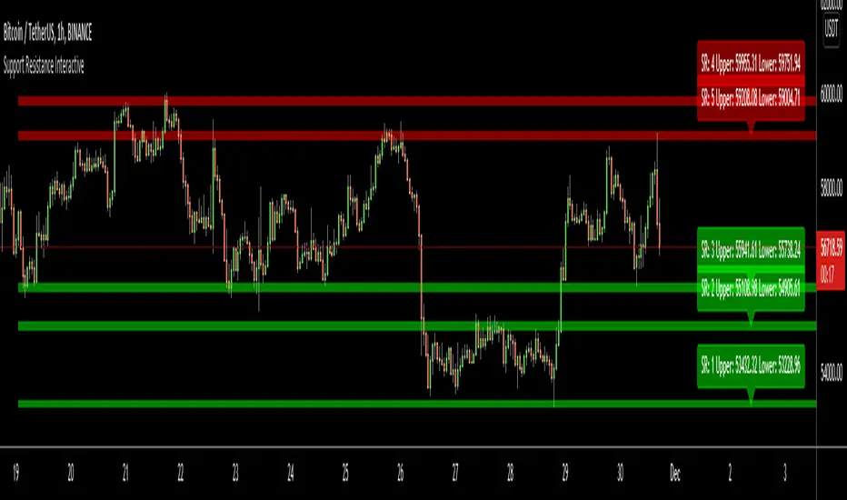
Support Resistance InteractiveHello All,
Using this "Support Resistance Interactive" script you can set the Support/Resistance levels interactively by clicking on the chart. Using the SR levels you set, the indicator creates Support Resistance zones. The width of the zones are calculated by using Threshold option and Threshold is the percent of the distance between Highest/Lowest levels in last 300 bars. if you set Threshold = 1 then it means 1% of the distance between Highest/Lowest levels. You can change SR levels by moving the level up/down by using your mouse anytime you want.
Now lets see it step by step;
After you added the indicator it will ask 5 Support/Resistance Levels and when you click any point then it's kept as S/R level and it asks another SR levels. if you want to use only 3 SR levels then last 2 SR levels are not important and you can click anywhere on the chart;
After you set all SR levels, it will ask "Number of Support/Resistance" . if you want to activate first 3 SR lines then set it 3. by default it's 5. when you set it click "Apply" and see the SR zones. that's it.
You can enable/disable alerts and set frequency, then create alerts. as it's interactive tool, the SR levels you set are specific for the current/active symbol. if you open another symbol then you better delete the indicator and add it again
Three Alerts exist in the script: Support Broken, Resistance Broken and Price in SR zone . you can enable/disable the alerts as you wish and you can set frequency for each one as "Once Per Bar" or "Once Per Bar Close"
by default Green/Red/Gray colors are used but You can change the colors using the options. according to the Price moves, SR zone colors are changed automatically.
when we have "Reset" feature to run the script interactively (like we added it for first time) I can update the script, then you will not need to delete/re-add each time you changed the symbol :)
In this example "Threshold" is 2 and "Number of Support/Resistance" is 4.
in this example "Threshold" is 0 and "Number of Support/Resistance" is 5.
Last example; Labels are shown for each zone, you can set location of the labels. SR order and Upper/lower band of each zone are shown in each label.
Enjoy!